
When CPI Drops, Yields Spike, and Bitcoin Moves: One Prompt That Turns Macro Chaos Into a Cross-Asset Brief
How the LLMQuant Macro Radar Skill compresses a full morning of research into a single, auditable page that tells you whether markets are actually trading the macro story they claim to be

Every time CPI prints, the 10Y Treasury yield jolts, or the Fed shifts its language by half a sentence, the same question circles back through every trading desk and research chat: what does this actually mean for tech stocks, long-duration bonds, and Bitcoin, right now, today? Looking up any single data point is trivial. CPI is public. The 10Y yield is one click away. Fed Funds, QQQ, TLT, BTC prices, all sitting in plain sight. The hard part is not the lookup. The hard part is the synthesis. Is inflation cooling further or quietly turning back up? When the 10Y climbs forty basis points in a month, is TLT actually selling off in line, or is something stranger happening? Is QQQ shrugging off rate pressure because AI earnings are doing the heavy lifting, or because the market simply has not priced the risk yet? Is Bitcoin still moving with risk appetite, or has it decoupled into its own narrative again?
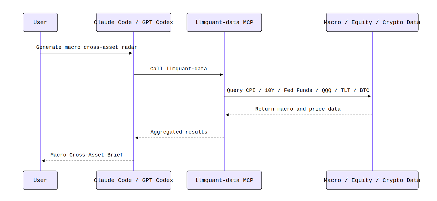
This is the gap the LLMQuant Macro Cross-Asset Radar Skill was built to close. It is not a prompt that asks Claude or GPT-Codex to wing a macro take from memory. It calls the llmquant-data MCP, pulls structured series for CPI, the 10Y, Fed Funds, QQQ, TLT, and BTC, and lays them down on the same dashboard so you can read, cross-check, and keep asking sharper questions.
One Sentence In, One Page Out
The interaction is almost unfairly simple. A user can type something like, “Use llmquant-data to generate a one-page macro cross-asset radar: pull the latest moves in CPI, 10Y Treasury yield, and Fed Funds, then compare recent performance across QQQ, TLT, and BTC.” Or phrase it the way an actual PM would: “Given the current rate and inflation backdrop, are QQQ, TLT, and BTC trading in line with the macro story, or are we seeing divergence?”
What comes back is not a wall of raw time series. It is a structured Macro Cross-Asset Brief with a one-line conclusion, a macro dashboard, a cross-asset radar table, an alignment versus divergence read, data quality notes, and a risk disclosure. The shift is subtle but important. You stop asking “what are the numbers?” and start asking “what is the market actually pricing?”
From Question to Brief: The Pipeline Underneath
If you did this by hand, none of the steps are difficult, but the whole sequence is exhausting to repeat every week. You would confirm the right tickers for CPI, the 10Y, and Fed Funds. Pull the latest readings and observation dates. Grab roughly twenty-four months of monthly macro history and around two hundred trading days of daily rate data. Pull QQQ and TLT price series. Pull a BTC snapshot and daily klines. Compute trailing returns across a few windows. Compare the direction of macro pressure against the direction of asset returns. Then write it up in language a human will actually read.
For a macro researcher, none of this is intellectually hard. It is just a tax on attention. The Skill collapses the tax into one call.
What Goes Into the Radar
The default input set is deliberately tight. CPI captures the inflation pulse. The 10Y Treasury yield carries the long end of the curve and effectively prices duration risk for the entire equity complex. Fed Funds anchors the policy rate. On the asset side, QQQ stands in for growth and tech exposure, TLT for long-duration bonds, and BTC-USD for the highest-beta, most liquidity-sensitive corner of the risk spectrum. Macro history pulls roughly twenty-four monthly observations for slow-moving series and up to two hundred daily observations for rates. The price window for assets sits at around two hundred trading days, which gives enough room to compute one-month, three-month, and six-month returns without overweighting any single data point.
This is not meant to be a complete map of the world. It is meant to be a clean radar. Six instruments, three macro and three asset, calibrated so that misalignment shows up clearly.
Reading the Dashboard, Not Just the Numbers
The macro dashboard reports the latest value, the latest observation date, the change from the previous reading, and a trend label for each indicator. The point is direction, not decimal precision. If CPI prints 3.1 percent year over year, down from 3.4 percent two months ago, with the 10Y at 4.45 percent and drifting higher despite the soft inflation read, that pairing alone is a story. Disinflation that is not pulling yields down usually means the market is pricing fewer cuts, stickier services inflation, or a heavier Treasury supply calendar. Any one of these changes the meaning of a QQQ rally that month.
The cross-asset radar table then translates that into returns. Suppose QQQ is up roughly 6 percent over the past quarter while TLT is down 4 percent and BTC is up 18 percent. On the surface this looks contradictory. Long bonds are saying “rates higher for longer” while growth equities and Bitcoin are saying “liquidity is fine, risk on.” The Skill does not pretend to resolve the contradiction. It flags it. That flag is the actual product.
Why This Is Not Just “Ask Claude About Markets”
This is the part worth slowing down on. If you simply ask a chat model “how is the current rate environment affecting QQQ, TLT, and BTC,” you will get a coherent-sounding paragraph. But the CPI number it cites, the yield level it references, the price ranges it implies, none of these are guaranteed to come from the same data lineage, the same observation date, or even the same definition of the indicator.
With the MCP wired in, the agent runs a deterministic chain: macro_indicator_search to confirm the canonical tickers, macro_indicator_snapshot for the latest values, macro_indicator_history for the trend windows, equity_historical_prices for QQQ and TLT, then crypto_snapshot and crypto_historical_klines for BTC. Every number in the final brief is auditable back to a specific call. That is the difference between commentary and research. The first one entertains. The second one survives a review meeting.
Alignment Versus Divergence: The Only Question That Matters
The most useful section of the brief is not the dashboard. It is the alignment read. TLT and the 10Y yield have a direct mechanical relationship through duration. A 50 basis point rise in the 10Y, on a fund with effective duration near 17 years, implies a price drop of roughly 8 to 9 percent before coupon. If TLT is down only 3 percent during such a move, something is offsetting the duration math, usually flows, hedging demand, or expectations of a sharp reversal. That gap is informative.
QQQ is more complicated. It is rate-sensitive through discount-rate mechanics, but earnings revisions, AI capex narratives, and concentration in a handful of mega-caps mean rates explain maybe half the variance, often less. Treating QQQ as a pure duration trade has been a good way to miss two years of returns. The Skill explicitly labels this linkage as “rate-sensitive, but not rate-only.”
BTC is the wild card. There are periods, particularly during 2022 and parts of 2023, when its correlation with the Nasdaq sat above 0.6 on a rolling basis. There are other windows where correlation collapsed below 0.2 or flipped negative entirely. Calling BTC a “liquidity asset” is directionally true on long horizons and frequently wrong on short ones.
How to Read the Brief in Three Layers
The cleanest way to consume a Macro Cross-Asset Brief is to read it in three passes. First, look only at the macro dashboard and form a one-sentence view: is the environment tightening, loosening, or holding. Second, look only at the cross-asset radar: are growth, duration, and crypto all moving in directions that fit your one-sentence view. Third, focus on what does not fit. The aligned positions are confirmation. The diverged positions are where alpha, or risk, actually lives.
A good brief should comfortably end one of three ways. Aligned, meaning the macro story explains the tape. Diverged, meaning at least one asset is trading against the obvious read and warrants further work. Inconclusive, meaning the data window is too short or too noisy to support a confident call. The third option matters. Forcing a narrative on inconclusive data is how research becomes marketing.
Why It Becomes a Skill Instead of a Prompt
Macro cross-asset work has a peculiar property. There is enormous variety in the conclusions and very little variety in the workflow. The questions change. The pipeline does not. That is exactly the shape of work that should be packaged as a reusable Skill rather than retyped as a prompt every Monday morning. Strategists get a faster weekly read. PMs get a fast sanity check on whether positioning matches the regime. ETF analysts get a one-page explanation for why a duration trade is or is not working. Content creators get a defensible scaffold for the “inflation, rates, and assets” piece they were going to write anyway.
The Skill does not predict tomorrow. It answers a much more useful question. Today’s tape, today’s macro backdrop, do they line up, or are they telling different stories.